A 2,000 square foot retail space represents a significant opportunity to craft a substantial brand experience. It is a canvas large enough for meaningful product storytelling and customer engagement, yet compact enough to demand intelligent, efficient design. This is the realm beyond the boutique but short of the big-box store, a space that must balance ample merchandise presentation with comfortable circulation, operational needs, and perhaps even a service or experiential component. The layout of a 2,000 sq ft space is not merely an arrangement of fixtures; it is the physical manifestation of a business strategy, choreographing the customer’s journey from curiosity to conversion while ensuring the behind-the-scenes mechanics run smoothly.
The foundational principle for this footprint is zoning. Unlike a smaller store where the entire space is a single visual field, 2,000 sq ft allows for the creation of distinct areas, each with a specific purpose. The classic and most effective overall shape is a rectangle, ideally with the long frontage on the 2,000 sq ft space’s main access point. This creates a natural, linear flow. The space should be divided into four primary zones: The Decompression and Impact Zone, The Primary Selling Floor, The Focal Point or Experience Zone, and The Operational Core.
The first ten to fifteen feet inside the entrance is the Decompression and Impact Zone. This critical area must feel open and uncluttered, allowing customers to transition from the outside world and orient themselves. This is not where you place high-margin impulse items; that comes later. Instead, this zone should feature a powerful, edited visual statement—a single dramatic mannequin, a striking art piece, or a large graphic that instantly communicates the brand’s aesthetic. The goal is to set the tone and briefly pause the customer, allowing them to absorb the environment before they begin their shopping journey.
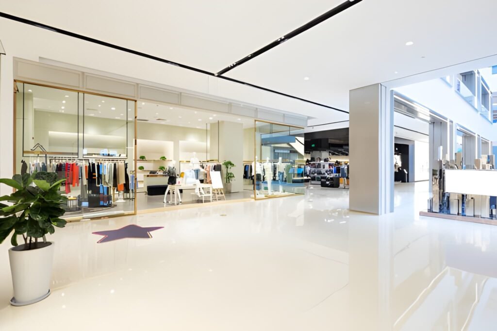
Beyond the entrance unfolds the Primary Selling Floor, which will constitute roughly 60-70% of the total space. This area is organized by a clear, looping path that guides customers along the perimeter. The walls are the most valuable real estate, lined with full-height shelving, slatwall, or custom millwork. The center of the floor should not be a void; it is prime territory for a combination of low-profile gondolas, mid-level tables, and rounders. These fixtures should be arranged to create a subtle pathway, breaking the space into manageable sections—for example, “Men’s Apparel” on the left wall and center fixtures, “Women’s Apparel” on the right. The key is to maintain clear sightlines from the front to the back of the store for both customer comfort and security.
Approximately two-thirds of the way into the space, directly on-axis with the main entrance, should be the Focal Point or Experience Zone. This is the destination. In an apparel store, this might be a premium lifestyle vignette. In a home goods store, it could be a fully styled table setting. For a service-oriented business like a boutique gym, this is where the workout equipment or class area is located. This zone gives the customer a reason to travel the full depth of the store and provides a memorable, Instagram-worthy moment that defines the brand.
Tucked away, typically at the rear corner, is the Operational Core. This encompasses the cash wrap, stockroom, and possibly a fitting room or consultation area. The checkout should be positioned to require customers to pass the majority of the merchandise on their way to it. A well-designed cash wrap is both a functional transaction point and a final merchandising opportunity, with space for small, last-minute add-ons. The stockroom for a 2,000 sq ft operation should be allocated 150-250 square feet, providing essential storage for overflow inventory, shipping supplies, and staff belongings without cannibalizing prime selling space.
Table: Zoning a 2,000 Sq Ft Retail Space for Maximum Efficiency
| Zone | Approx. Sq Ft | Key Elements | Design & Strategic Purpose |
|---|---|---|---|
| 1. Decompression & Impact | 150 – 200 sq ft | Clear space, bold visual, brand signage. | To welcome, orient, and set the brand tone; prevents immediate sensory overload. |
| 2. Primary Selling Floor | 1,200 – 1,400 sq ft | Perimeter wall displays, central gondolas/tables, category-defined sections. | To maximize product exposure and facilitate a natural, exploratory browsing flow. |
| 3. Focal Point / Experience | 200 – 300 sq ft | Lifestyle vignette, featured collection, service area (e.g., tasting bar, gym floor). | To create a destination within the store, drive engagement, and anchor the brand story. |
| 4. Operational Core | 200 – 250 sq ft | Cash wrap, stockroom, fitting rooms, office nook, employee bathroom. | To support operations without disrupting the customer experience; provides secure storage and transaction space. |
Lighting, Technology, and the Customer Journey
Lighting in a space of this scale must be layered. A base layer of ambient light from recessed cans or track lights ensures the space is evenly illuminated. A second layer of accent lighting—focused spots or track heads—is used to highlight wall displays and the central focal point, creating pools of light that draw the eye and add drama. In specific areas like the cash wrap or a product demonstration table, a third layer of task lighting is essential.
Technology should be seamlessly integrated. A modern Point-of-Sale (POS) system with multiple terminals prevents checkout bottlenecks. If the business model supports it, interactive tablets or digital screens in the Focal Point Zone can provide deeper product information or brand content. For inventory management, a robust system that tracks stock levels in real-time is non-negotiable to manage the higher volume of SKUs that a 2,000 sq ft space can hold.
The ultimate success of a 2,000 sq ft layout is measured by its ability to tell a story and facilitate a journey. The customer should feel guided but not controlled, discovering new products as they move from zone to zone. The layout must feel intuitive, with a logical progression from entry to browsing to a culminating experience and finally to a smooth transaction. Every decision, from the width of the aisles to the height of the fixtures, must be made with the dual goals of maximizing sales per square foot and creating an environment where customers feel comfortable, engaged, and eager to return. This space is large enough to build a world; the layout is the map that invites customers to explore it.