The concept of a one-color palette in interior design is often misunderstood as a stark, monotonous, or limiting choice. In reality, a monochromatic scheme is one of the most sophisticated, calming, and visually expansive strategies a designer or homeowner can employ. It is not the absence of color, but a deep exploration of a single hue across its entire spectrum of tones, tints, and shades. This approach shifts the focus from the drama of color contrast to the subtle interplay of light, texture, and form, creating a space that feels intentionally curated, harmonious, and deeply restful.
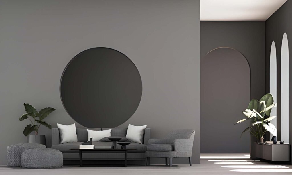
The foundation of a successful monochromatic scheme is the selection of the base hue itself. This choice sets the entire psychological tone for the room. A palette built around blue evokes serenity, stability, and depth, making it ideal for bedrooms and studies. Green, the color of nature, creates a restorative and balanced atmosphere, perfect for living rooms and spaces meant for relaxation. Gray offers unparalleled sophistication and flexibility, serving as a neutral canvas that can feel either cool and modern or warm and cozy. Warmer hues like terracotta or earthy brown generate a sense of warmth, security, and organic connection. The key is to choose a color that resonates on a personal level, as you will be living within its full expression.
The true artistry of a one-color palette lies in mastering value and saturation. Value refers to the lightness or darkness of a color, while saturation refers to its intensity. A flat, single shade of paint on every surface will indeed feel lifeless. The magic happens when you create a layered composition using a range from pale tints to deep shades. For example, a blue palette might feature walls in a pale, airy sky blue, a sofa in a mid-tone slate blue, and an accent wall or a piece of furniture in a deep, dramatic navy. This creates a sense of visual depth and dimension. The eye travels effortlessly across the room, perceiving variety and interest without the jarring effect of a contrasting color. This value contrast is what gives the space structure and prevents it from feeling like a blur.
The Critical Role of Texture and Sheen
In the absence of multiple colors, texture becomes the primary language of visual and tactile interest. A monochromatic room is a symphony of different finishes and materials. Imagine a living room in a neutral beige palette: a nubby, wool bouclé sofa sits against a grasscloth wall covering, atop a thick, sisal area rug. A smooth, polished marble coffee table holds a book with a linen cover, while light reflects off a metallic brass lamp. Each of these elements is within the same color family, but the variety of textures—soft, rough, smooth, shiny, matte—creates a rich, layered experience that is endlessly engaging. The brain reads these textural differences as complexity, satisfying the need for visual stimulation without chromatic contrast.
Similarly, the strategic use of sheen is a powerful tool. Using the same color in different finishes can define architectural elements. A matte finish on the walls, a satin finish on the trim, and a high-gloss finish on the ceiling or cabinetry will create subtle, reflective variations that add depth and sophistication. This play of light on different surfaces ensures the room feels dynamic throughout the day as the sun moves.
Table: Building a Cohesive Monochromatic Palette
| Element | Role in the Palette | Implementation Example (Green Palette) |
|---|---|---|
| Walls & Ceiling | The canvas; establishes the lightest value. | Pale seafoam green in a matte finish. |
| Large Furniture | The mid-tone anchor; provides visual weight. | Sofa in a mid-tone sage green velvet. |
| Accent Elements | The deep shade; adds drama and definition. | An accent chair or built-in shelves in a deep forest green. |
| Textiles | Introduces pattern and texture. | Throw pillows in a mix of emerald green linen, celadon silk, and a patterned fabric incorporating various greens. |
| Metals & Wood | Provides neutral grounding and reflective contrast. | Warm brass hardware and light oak flooring to balance the cool greens. |
To prevent a monochromatic scheme from feeling sterile, the intentional introduction of a neutral foundation is essential. While the palette is built around one color, it is almost always anchored by neutrals. Floors in natural wood, large furniture in a creamy off-white, or window treatments in a stark white provide visual relief and prevent sensory overload. These elements act as a “breathing space” for the dominant color, allowing it to shine without overwhelming the occupant. Metals like brushed nickel, warm bronze, or polished chrome also serve as non-colored accents that add a layer of sophistication and break up the color field.
In conclusion, a one-color interior design palette is a testament to the power of restraint and nuance. It is a challenging but profoundly rewarding approach that results in a space of exceptional harmony, elegance, and tranquility. It demands a keen eye for the subtle variations within a single hue and a mastery of texture and form. Far from being boring, a well-executed monochromatic room is a deeply immersive and personal environment, proving that sometimes, the most powerful statement is made not with a chorus of colors, but with the focused, resonant note of one.